
Tuesday, 10 November 2009


Thursday, 22 October 2009
Double Page Spread Doves
This is a double page spread from the music magazine MOJO. 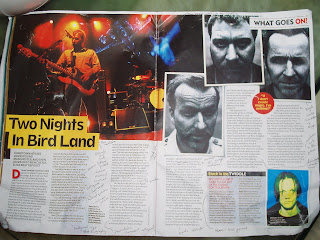 This magazine covers the alternative music scene.
This magazine covers the alternative music scene. The headline and the pictures on the two pages look as if they have been cut out and put on the page. This connotes the magazine may be giving informal and mostly gossip like information.
The pictures of the band members are in a black and white polaroid format with a close up angle looking like a police file image this may be representing the bands attitude and the image they are trying to reflect. The image they are trying to portray is that there a gritty band that wasnt a manufacturered air brushed created band.
The headline is set against a yellow background with black bold writing inside of it. The yellow contrasts against the black text making it noticable to be seen.
The main image is a long shot of the band performing live on stage during their tour. This could be showing what the band are up to at the moment.
In the upper right corner is a section heading saying " What Goes On" this is telling the reader what part of the magazine they are reading and could be further emphasising what the doves are doing at the moment with their tour.
The text is split up into sections the first part of the article is a review of the concert the writer has just seen and he is judging there performance and writing about what songs they done. The next section of text is an interview with the band during this interview they continue to use slang and colloquial language which is representing there image as just ordinary people. The section after this is a band biography and discography telling the reader what the band has achieved with there music and albums. As well as telling the reader how they started. After this is a section of the band taking part in some banter. Further emphasising on the bands attitude to being these ordinary people.
There is also a puff amongst the text with a quote from the article inside of it. This makes the quote stand out since it the red and yellow is contrasting against the plain white background.
Wednesday, 21 October 2009
NME Contents Analysis
This is the contents page for music magazine NME. The first thing which is noticed is the masthead clearly shown at the top left in large,bold red writing. This lets the reader associate with the magazine. Next to this is "This Week" written in big bold writing this is used as a substitute for the  word contents because i believe the readers who are teenagers will be able to associate with this over the contents.
Across the left hand side is the left hand side is an index of of all the bands/artists featured in the magazine giving the page numbers they are on. This is set on a red background with white and black text contrasting of it. I think this is because it could be important information for a reader and the colours contrasting allows it to stand out the page.
Across the right hand side are a selection of different sections in the magazine. For example one section is about news and another is about reviews. This allows the reader to find a section easily. As well as this it tells the reader information about what is in each section for example in the reviews section it gives further detail on how to find album reviews.
In the bottom right corner there is a puff saying "The UK's No1 Gig Guide Starts p58". This is written inside a red box with the white text inside contrasting against the red. This may be laid out like this because the publisher expects this to be an important article in this issue of the magazine.
The pictures in the middle are taken by fans it says in the text below. I think the ideology behind this is that the publishers of the magazines want to see the fan interaction with there magazine letting the fans know that the magazine cares about them and wants there input.
Underneath this is an advertisement promoting a subscription to the future issues of the magazine. This is set out on a black background with yellow text inside of it promoting the discount they can save. The black at the bottom stands out against the white main background and the text inside of it contrasts against the black allowing the reader to see what it says clearly.
 word contents because i believe the readers who are teenagers will be able to associate with this over the contents.
Across the left hand side is the left hand side is an index of of all the bands/artists featured in the magazine giving the page numbers they are on. This is set on a red background with white and black text contrasting of it. I think this is because it could be important information for a reader and the colours contrasting allows it to stand out the page.
Across the right hand side are a selection of different sections in the magazine. For example one section is about news and another is about reviews. This allows the reader to find a section easily. As well as this it tells the reader information about what is in each section for example in the reviews section it gives further detail on how to find album reviews.
In the bottom right corner there is a puff saying "The UK's No1 Gig Guide Starts p58". This is written inside a red box with the white text inside contrasting against the red. This may be laid out like this because the publisher expects this to be an important article in this issue of the magazine.
The pictures in the middle are taken by fans it says in the text below. I think the ideology behind this is that the publishers of the magazines want to see the fan interaction with there magazine letting the fans know that the magazine cares about them and wants there input.
Underneath this is an advertisement promoting a subscription to the future issues of the magazine. This is set out on a black background with yellow text inside of it promoting the discount they can save. The black at the bottom stands out against the white main background and the text inside of it contrasts against the black allowing the reader to see what it says clearly.
Friday, 16 October 2009

Thursday, 15 October 2009


Kings of Leon Cover Analysis

This is the cover to "Q" magazine featuring rock band Kings of Leon. The front cover features the 4 band members jumping through shards of glass as if they have broke it. This effect relates to headline "Break Through" because i think it is reflecting on the bands break through into becoming a mainstream band. This could be seen as a visual metaphor of the journey to becoming big stars in the music industry.
As well as it being a metaphor for there journey to becoming big stars it may represent there rock star image as the stereotypical rocker is seen as being wreck less and the breaking of glass may reflect upon this attitude.
The magazines masthead is as usual in the top left corner but however this time is covered by members of the band so the logo can only be partly seen. I think this is because the main image of the band take precedence over the logo because they are so popular in today's music.
Surrounding the image of the band are a couple of puffs showing what else is featured in the magazine. This may further entice somebody into buying the magazine. One of the puffs is "Play time for The Killers" this may intrest other readers into buying the magazine because they are a fan of that band.
Also another puff is the "Top 50 albums of 2008". This is a feature inside of the magazine which may also entice people into buying it as they want to know which album has came first in the rankings.
In the puffs keywords are coloured in red this is to contrast the dark background to make the words stand out to a reader. This will make the reader recognise what else is the magazine and persuade them to buy it.
Subscribe to:
Posts (Atom)